Make branding uncomplicated
- Mar 16
- 12 min read
Updated: Mar 23
In a world of overwhelming communication, it stands to reason that simple communication is more likely to be remembered because there is less to remember.
That statement right there, if we put our ‘consumer’/’customer’ hat on for a moment, we’re constantly bombarded with tremendous amounts of communication each and every day that our brain has to sift through, interpret and remember. With technology it’s only become even more overwhelming and as a result, harder for communication to cut through when it comes to marketing a brand so that people notice, remember, recognise, think of and choose one brand over another.
For most customers, they are more likely to choose the brand they are most familiar with, even if they’ve never bought from them before and over time that familiarity has happened because of how much the brand has shown up over many years and has become a brand that is easily thought of when associated with what that customer needs. Be it Kleenex with facial tissues, McDonald’s with fast food, and Apple with personal computing.
But each of those brand examples have been around for decades and have grown at times when this technological abundance of communication was less invasive, shall we say. And as you’ll have no doubt seen, these brands have become far more ‘simple’ to break through that overwhelm.
So if you have a brand that is trying to break into the market or at least grow its current market presence, how do you rise above the clutter to captivate attention, connect with consumers and be a go-to brand over others? Make your branding and your marketing efforts uncomplicated. Like I said at the start, it stands to reason that simple communication, be it a logo, a branded message, a brand name, a design style or a packaging look & function, is more likely to be remembered and recognised because it is less information your consumers need to remember.
What not to do is as important as what to do
There’s a saying in branding, especially when it comes to the strategy you develop to guide your brand to success, is that identifying what not to do is as important as choosing what you’re actually going to do. That part of this process is to gain as much insight as possible, that will end up meaning a multitude of different strategies could be formulated. By identifying all possible options, you start to realise what is viable, what is achievable, what is best for your brand as much as it is for your customers and in that process you could choose multiple strategies but we are often limited by our capacity to do so.
However, if you choose one single-minded approach it means your strategy is less likely to be complicated when putting it into practice. It doesn’t mean the other strategies can’t be done, it just means you have greater clarity that will permeate into all facets of your branding and marketing efforts. But it does mean that you need to find restraint in order to achieve that clarity.
Find restraint
A good mate of mine, Shane Carrol from Aspect Brands posed this question to me the other day that inspired the topic of this article, as he asked, “Oi, why is a simpler logo better?” and in reply I kept it brief, “Less detailed, easier to recall”. He then brought up a fair point after giving him my answer, “In fields where possibilities are limitless, restraint is considered mastery. As in, your logo could be absolutely anything & everything, graphically speaking. So much so, that simplicity & restraint are the most powerful indicators of mastery.”
What he meant by that, is that even for me as a branding person that can also design things visually, when it comes to designing my logo, I could flex beyond all other businesses to demonstrate my ability in a visual manner to make something that is visually stunning. However, I also know that if I did this, it would be less effective.
So for my own logo, it's two simple white lowercase letters ‘gf’ in a pink circle. There’s no flourishes, no overwhelming amount of personality, and no clue to give away what it is I do. As I know the purpose of a logo is to be identifiable rather than communicate what it is I do. I made it so simple I could even use my lawn mower to etch in the shape of my logo in my backyard lawn.
The simpler it is, the easier it will be to use in all kinds of contexts and then also be recognised in all kinds of contexts. Additionally, and you might have heard this expression before, your logo only needs to be an empty vessel that is made for you to fill it with associated meaning. Meaning we don’t need to say anything about our brand in our logo, just the same as the cover of a book.
For visual designers, copywriters and any type of creative in a commercial context for that matter, we need to find restraint in the way we communicate, just the same as an industrial designer would to make sure something like a door can be easily opened and closed and still fit the aesthetic of the building. Because if we make that communication complicated, it becomes harder to use and harder to understand, recognise and remember.
So like I said about choosing one single-minded strategy, restraint is ensuring your brand has a clear shot at success with the simplest, easiest, uncomplicated form of branding and marketing you can implement for your benefit and for that of your customers. The problem with this sentiment is that it often gets interpreted as being ‘boring’ or ‘bland’, and so has become this term, ‘blanding’.
Simple doesn’t mean boring
I hate the term ‘blanding’. It’s a slap in the face to those who use restraint to produce effective branding outcomes, as it insinuates a level of laziness that is akin to looking at a Mark Rothko or Piet Mondrian artwork and saying, “That’s not art, my 5yo could do that”. But here’s the thing, it often centres around a logo and funnily enough, when placing similar simple looking logos next to each other, and comparing them to other logos (and in most cases, previous versions of each logo before it was ‘blanded’) that have more decorative logomarks and wordmarks as if to say there’s a loss of personality.
If how a logo looks dictates how much personality the brand has, it’s like saying if you have an unattractive face you must be a boring person. It’s total BS. As effective communication isn’t measured by a level of intrigue, it’s by how easy it can be understood and remembered. It’s why we use symbols to communicate complex information. However, whether it looks boring or bland is subjective and irrelevant, and only serves a purpose to communicate a tone of expectation for the brand. Which isn’t to say it’s not valuable, as you can add character but not at the expense of clarity.
What I will say is that over time there are going to be ebbs and flows in style and aesthetics that people create and gravitate towards. Trends we call them. But as many successful brands have evolved, they have simplified the manner in which they communicate to make their brands less complicated, which indeed might be their logo. And this change in style to something more ‘bland’ and ‘boring’ could also, in part, be a move away from what might have been a trend at the time it was first made and they are adapting to what is more effective now. But the potential problem from this, is that the trend setters influence those around them. So for newcomers to a market, they follow the leaders and end up looking like one in a herd of sheep. This is obviously not what you want to do, and of course it ends up devaluing my own services when someone could just point to a brand and say, “Hey, make it look like them” and POOOF! you have a brand...which doesn't make a better brand.
So my point here is that simple and uncomplicated, doesn’t mean bland and boring. It’s not cause and effect. When I said to my mate Shane, “Less detailed, easier to recall”, all this means is to ensure that your branding (including your strategy and marketing efforts) are easier to use in practice and easier to recognise and remember.
Simpler is easier to use in practice
When we set out to develop a brand for your business, we start with the customer need in relation to the offer we think we can deliver to them and the competitors we’re up against. This is the basis for our strategy to formulate how we’re going to win, if we keep it simple, it will be easier to understand and execute for everyone in your team. And I mean everyone from your CEO, to your receptionist. If the strategy is a clusterfuck of several ideas of what success will look like, with too many directions to try and achieve that, without the capacity to navigate that mess, it becomes far more difficult to achieve in practice, yes?
Similarly when we develop the identity for your brand, we start from the inside out. If the common purpose everyone in your team gets out of bed to work towards is a two to three paragraph diatribe, do we reckon that’s going to be understood, let alone followed? If we have 10 bullet points of brand values, do we think we’re going to remember them, let alone find people to join our team that embody all of those 10 values?
Or when we communicate externally to our customers, if we have 6 different key messages to deliver day-to-day in our efforts to market the brand, are we going to remember each of them to ensure each of them are used? If we have 8 different brand colours, is it going to be a pain to continually use them in all the things we design? If we have a really detailed logo and we want to embroider it onto clothing for our team uniforms, is it even possible to do so?
These are the considerations that branding people are considering, or at least the good ones are. For me when developing a brand for my clients, I’m just as much conscious of how easy it’s going to be for them to use as it will be for their customers to be captivated by, recognise and remember. Because for the most part, I’m working with small to medium businesses that don’t have a team of branding and marketing people within their organisation to interpret and use what I develop for them, especially to execute things like packaging, presentations, signage, websites, content, ads and more. As this stuff is not everyone’s forte and many end up creating additional collateral themselves in programs like Canva, if they don’t already have external suppliers helping them produce those things.
Even other designers and marketers that need to inherent the branding someone else has made, often struggle with maintaining brand consistency if what has been produced is a hodge podge to begin with, OR they end up going rogue to produce whatever they think, because the branding was too complicated to begin with.
Simpler is easier to recognise and remember
I’ll never forget this bit of advice that Marketing professional and professor, Mark Ritson said about brand building and positioning. He said words to the effect of “To customers, brands are little things, and out of the billions of brain cells a customer has, if we can only occupy a few brain cells in a consumer’s mind, what are the most important bits of information we fill them with for them to remember us by?” This was his clear way of suggesting how positioning can be done effectively and why it can’t be a 40 page strategy deck that we impregnate into a customer’s mind for them to choose us over others.
His suggestion is to stick with a very simple idea (be it your service/product, its benefit, or its mission/ethos) that your brand can be known for, pair it with 1-2 messages and add 1-2 distinct qualities like a logo, or colours, or a mascot, or sounds, or packaging style to keep it simple.
“HEY HEY HEY! But why do we make all of those things and not just 3 of them?” You might ask and it’s a great question. To this I’d say we make all more distinctive assets than we need, like messaging, mascots, logos, sounds, packaging styles, patterns, photo/video style and more, because there will be instances where your brand is going to show up and not every single one of these things needs to be present. Additionally, these distinctive assets take time to become familiar with people and to build greater associations over time, we can slowly integrate them more and more. To the point where a logo or brand name doesn’t need to be present for the brand to be recognisable. But again, the simpler these things are, when you add them all together, they’re going to be far less complicated to remember as a whole.
So as a bit of a way to demonstrate complicated and uncomplicated communication when it comes to your brand, I’m going to ask you which numbers of the two numbers below are easier to remember:

This is the same as a customer remembering 10 things about your brand, rather than 3. Makes sense, yeah? One is clearly going to be easier than the other to recognise and remember.
Now, if I give you three sets of numbers and each set only has 3 numbers, it's fairly easy to distinguish one from the other and probably remember the set you liked best, right?

Remember before when I said you can add character but not at the expense of clarity? If I keep the first number basic, but tart up the other two numbers at varying degrees of visual aesthetic. Of course the two designer-looking number sets get your attention more than the bland boring one.

However, my point here is that while the two I’ve tarted up get your attention, the one that is overwhelmingly stylised is likely to be less effective because there’s too much information to remember it by. Because there’s several colours, three different font styles and kinda looks like a ransom note. It’s complicated to remember and recall those details again and there’s less likelihood of us remembering it. Like I said before, it stands to reason that simple communication is more likely to be remembered because it is less to remember. You can and should make it distinct, but not so much that it’s too much to process and store in your customer’s minds.
Context matters
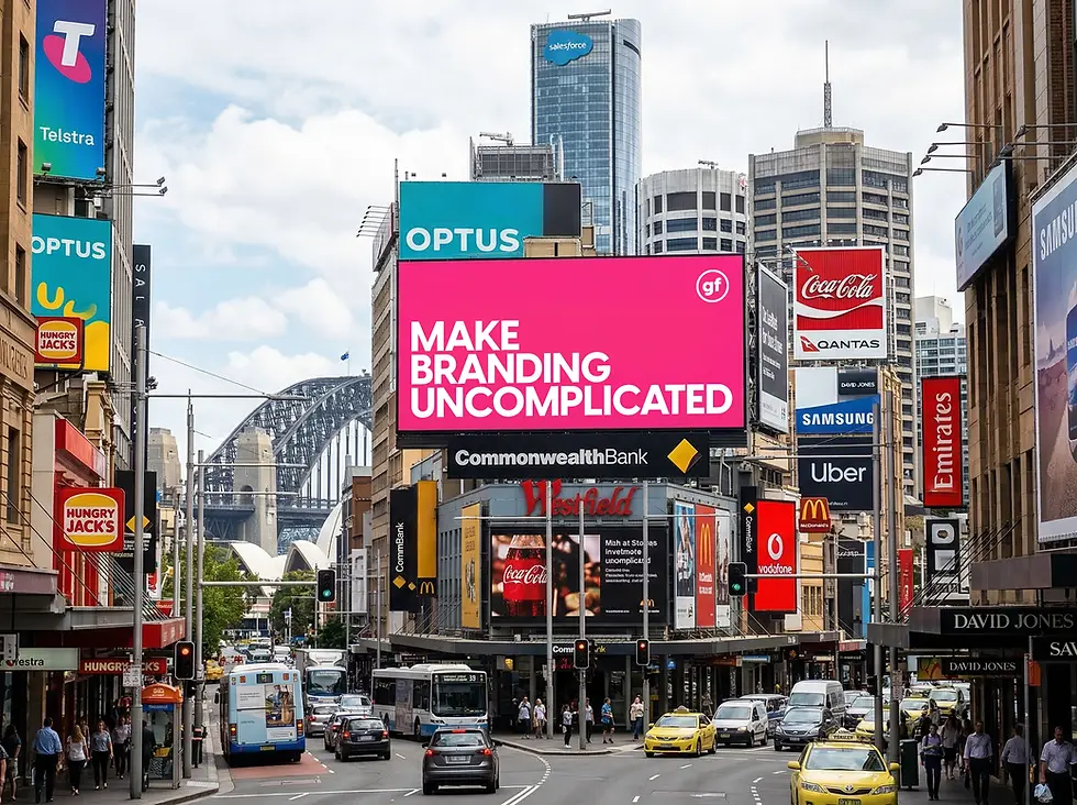
When your brand shows up in places you want people to remember you, rather than buy from you, this is a big reason why the way your brand communicates is so important. Context matters greatly, especially when your brand is less famous. So when you’re advertising your product or service on an outdoor billboard or on a Meta ad on Facebook or Instagram, that communication can’t be an overwhelming experience or it will be ignored or forgotten.
These Out-Of-Home (OOH) instances where your brand shows up, any bit of communication needs a clear bit of messaging and visual or sound that conveys what you’re offering, as well as your distinct logo and/or brand name to build those associations away from where your product or service can be accessed/bought. Because you have such a brief opportunity to captivate people, let alone help them connect the dots and remember your brand the next time they encounter or need your brand.
Whereas when they’re at your stomping grounds, be it on a pack on the shelf, or on your website, or at your shop, you have the opportunity to give a bit more detail and it not be so overwhelming because your customer is looking for the detail in that context. That isn’t to say your communication can then be overwhelming, it’s merely to say that there is a bit more time to communicate to your customer with a bit more detail or nuance…like this blog you’re reading.
So when you’re developing your brand, make sure you’re considering the contexts where brand awareness is built, so that you can deliver uncomplicated communication. Because when those customers think of or see you again at the point of buying, you’ll be thought of and/or recognised. As brands aren’t important to people until they are needed, and you want to build those clear associations before they’re ready to buy so that when it comes to buying, your brand is more likely to be considered and hopefully be the first they consider.
Give your brand a KISS
I mean you can if you want to, and the K.I.S.S. I’m referring to isn’t the rock band either. What I’m talking about is that saying, Keep It Simple Stupid. If I were to audit your brand, apart from identifying the alignment between your strategy, your team and your customer, I would also be looking at the relative simplicity with which your brand has been developed and how it’s put into practice on the day-to-day. If it wasn’t all that end-to-end clear, an amended strategy goal would be to keep it simple. To pair back to complicated and reduce any clutter. I’d be Marie Kondo’ing your brand like she does to a cluttered house.
Uncomplicated insurance, uncomplicated healthcare, uncomplicated investing. Every industry is striving for a simple customer experience and it can start with your brand by reducing the clutter in your brand to create clarity. And I’m a big believer that clarity is a fundamental part of brand development and brand success as a result. It keeps you focused, it gives you a single direction to head and it can help achieve consistency, instil confidence and create a well defined experience for customers to value. Anything short of that might be a reason for a lack of success if your product or service is spot on. So to give your brand a shot, better branding starts with clarity, to create uncomplicated business success.


Comments