JKL Real Estate
CASE STUDY
An independent real estate sales and property management agency based in Forster, Australia.

OVERVIEW
Since 2021 I've been working with JKL Real Estate to rebrand their business and maintain their brand presence
BRAND STRATEGY
INTERNAL BRAND IDENTITY
BRAND MESSAGING
VISUAL IDENTITY DESIGN
SIGNAGE
STATIONERY
MERCH + GIFTS


Brand Strategy
Owners Dan and Lauren took over the family business in 2021 to continue operating JKL Real Estate with the goal of bringing their branding into a new era and modernise a brand that had stood unchanged since the late 90's.
Being a family owned and operated business, it was also brought to my attention that much of their team had their own familial connections. In addition to this, their sales team in particular made their client experience feel like they were just a part of the family.
Now they often say not to treat a business as a cliché "family", but when the business literally is a family experience, the obvious choice to position this brand was "your real estate family - the trusted experts in real estate that you can turn to, just like family".

Brand Identity
With this 'real estate family' concept in mind and the desire to have a modern and professional update to their brand look, we first started with their messaging.
Phrases like "welcome home" that captured an experience for buyers and renters, and for sellers, a more cheekier slogan of "the Forster (real estate) family you get to choose" - as a play on the town name of Forster they operate in and foster families.
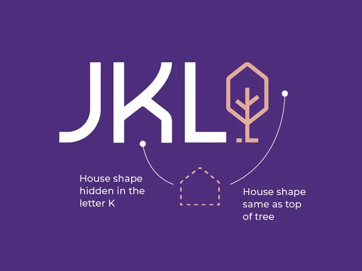
When it came to their visual look, we decided to keep the purple as they'd be the only purple real estate agency in their area, but introduce a symbol of a family tree alongside the JKL logo that also has a hidden symbol in the K, if you can spot it, that is synonymous in real estate.

Better branding
outcomes
As a result of their rebrand, we've gone onto producing their sales and property management signage (eg. for sale billboards), stationery for client documents and staff use, an updated website look with the new branding applied, social media branding and content templates, as well as several merchandise and gift items for their team to utilise in their sales process.
But not all branding can be rolled out all at once when the branding is completed, even as the brand evolves over time. For some businesses this can be a slower process and I'm happy to say that their team have finally had the opportunity to implement their signage using the concept design I helped them produce.
Even though they were already kicking goals in so many ways already, with real estate agency awards and topping many sales stats for their area that All this has given their team a great foundation to further develop their business and guide the direction Lauren and Dan plan to take it in the future and be the go to 'purple real estate agents' in Forster, NSW (Australia).

"I’ll be the first to admit that I was hesitant, maybe even had a small case of buyer regret in the beginning, having just committed to the biggest outlay for our brand in 26 years. But, would I do it again…100% I would. The way that Frank was able to extract the feelings, history and experiences that we want to portray as an independent real estate brand and then reinvent that into something that we can use both visually and in written word to both our internal team and the community is truly remarkable. I have already recommended Frank to a few other independent agencies in our industry. Worthwhile investment."
DAN SCHUBERT - JKL REAL ESTATE CO-DIRECTOR


