Saweetway
CASE STUDY
A natural sweetener product brand, selling the first allulose-based sweetener in Australia.

OVERVIEW
In 2025 I partnered with Saraya Australia to develop a new natural sweetener brand that would see the first 100% allulose-based sweetener on the Australian market.
BRAND STRATEGY
NAMING
INTERNAL BRAND IDENTITY
BRAND MESSAGING
VISUAL IDENTITY DESIGN
PACKAGING
STATIONERY
ADVERTISING

Brand Strategy
When we developed the Saweetway brand strategy, we set out to create something more than just another sweetener. Its foundation was focused on supporting better metabolic health, especially without the compromise of losing the the joy of sweet foods.
We set out to build a brand that felt vibrant, joyful, and genuinely supportive of healthier lifestyles. From the beginning, our focus was on helping people keep their favourite foods sweet without the usual compromises.
So we centred the strategy around key moments our customers care about most. From baking and sweetening drinks to indulging without the sugar crash and "keep it sweet".

Naming
Naming is always a challenge when it comes to originality and sometimes compromise to find the sweet spot (pun totally intended). And this was definitely the case for use when settling on and registered a name for this brand.
Initially we had a more scientific name to lean into the metabolic health foundation of the brand. However, with a demographic focus on a younger generation of health-conscious consumers in mind. Their unconventional use of language was considered in conjunction with our desire to keep it sweet in our new way, we kept coming back to the words 'Saweet' and 'Way'. So to achieved naming registration approval we ended with 'Saweetway'.
Brand Identity
By centring the strategy around key moments our customers care about most our messaging aligned with these real-life use cases, to shape a brand that feels both imaginative and relatable.
What emerged was bold brand personality, a voice that’s playfully confident and down-to-earth, with a clear message — "make life colourful, keep life sweet". That’s the Saweet way.
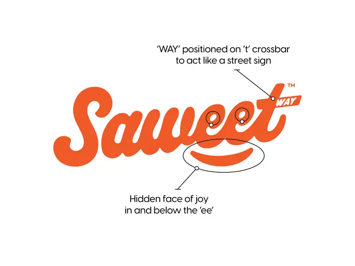
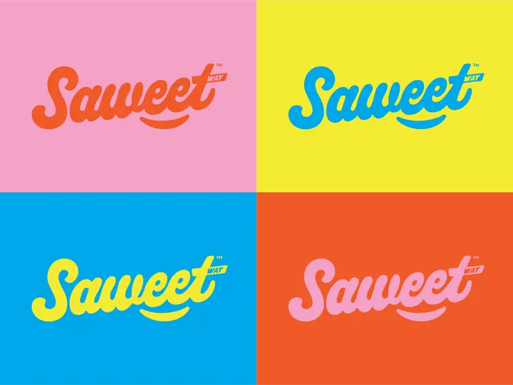
Visually, we knew Saweetway had to stand out. Not just on the shelf, but in people’s minds. So we built a bold, energetic visual logo and look that bursts with colour and optimism. Every element, from our punchy palette to our playful hexagon motifs, was designed to feel fresh, fun, and full of personality without looking like the competition.

Packaging + brand presence
With the brand established and concept product development approved for production and sale in supermarkets, we moved onto developing the pouches, bottles and shipping cases for their first five products. Within a 3 months there were products on supermarket shelves nationally across Australia.
This lead to the Saweetway team developing their online presence with a website, social media content and getting their name out into health and wellness magazines and sites with advertising and various ebooks.

Better branding
outcomes
Since partnering with the Saweetway team, they've established a brand presense in Woolworths supermarkets nationally and various health food stores across Australia.
It has been great to see their team lean into the brand identity we developed and showcase great uses of their products that align with customer use cases, across online and traditional media.
As the brand grows in awareness and household uptake, I'm sure a pipeline of new products and possible partnerships will help to further achieve their goal of supporting Aussies with better metabolic health outcomes.

Give your brand a shot at better branding like this brand did by booking a call with Frank.
Sydney, Australia
email: gday@gdayfrank.com


