Establishing the problem
After many years operating a successful full-time recruitment service, Pettit Pharma & Device Search had been looking to diversify the capabilities of what it could deliver its clients in the medical and pharma industry.
The idea to establish a new temporary recruitment service similarly catered to the same industry was identified as the best direction PPD Search could take.
The problem when reaching out to us in mid-2018, was whether this new service required its own branding as a type of sub-brand of the main PPD Search business?
Process:
1
2
3
4
5
6
Strategy - DISCOVERY SESSION
Proposal
Messaging - TAGLINE
Logo Concepts
Visual Identity
Rebrand of PPD Search

Strategy

Meeting to discuss their new venture led to us all to agree that a brand identity project with the objective to create a sub-brand under PPD Search was what their business needed.
We initially carried out a strategic discovery session to identify the differing attributes this service could communicate, to be clearly identified as a sub-brand by their clients. This process established client personas to understand the unique needs their clients would have for a temporary recruitment service.
Our session also identified the naming conventions for the brand, initially as Pettit People but later decided upon as PPD People.

Objective:

The Goal
Our goal was to create a brand identity for the temporary recruitment arm of Pettit Pharma & Device Search, to be known as PPD People. This project involved logo design, positioning, messaging, an expanded visual identity and branded social media templates.
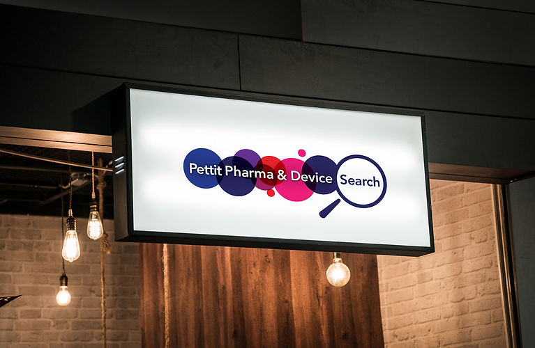
Stylistically PPD Search was looking for a logo that could complement their existing logo when sitting side-by-side, which meant a correlation of colours and potentially the circle elements, magnifying glass and/or font from their current logo.
However, during our initial discovery discussion, there was a subtle hint noted that a redesign of their existing logo (not designed by G'day Frank) may be something they would consider as a result of this project, due to their mild indifference towards what their existing branding meant for their business.
Client Objectives
For their Clients:
-
Create a recognisable and trusted brand.
-
Identify competitor brand identities/services
and boldly exceed expectations.
For their Candidates:
-
Create a recognisable and relatable brand.
-
Entice a large candidate pool with a human approach.
-
Consistently and efficiently find the right people for the job.


Messaging
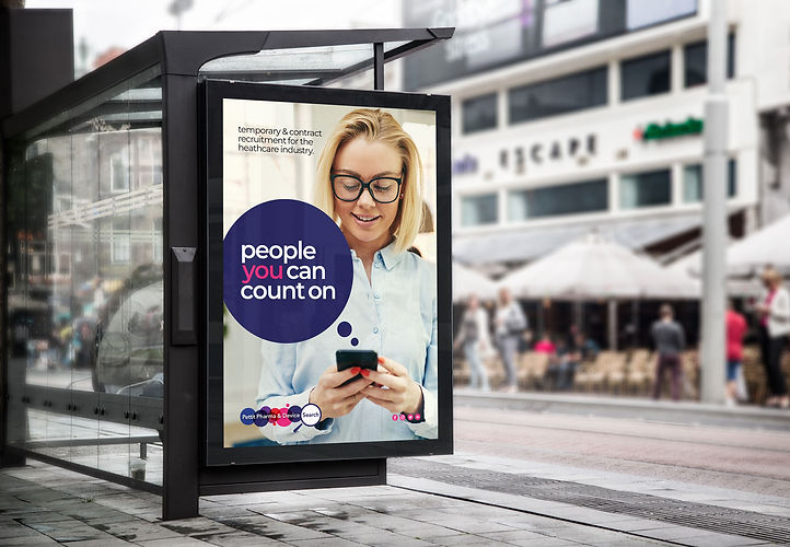
One thing we wanted to provide PPD Search with, was a clear and concise brand message for PPD People that spoke to their two types of customers (Clients and Candidates) and potentially be applied across the business if well received. We selected key brand attributes from the discovery session that personifies PPD People and their target audience and developed a simple tagline that produces an intended dual meaning.


The meaning to Clients:
PPD People reliably find the people you can count on.
The meaning to Candidates:
PPD People are the people you can count on to find the job for you.
The Logo
Our design process looked at multiple creative directions based on our clients’ objectives. We focused on creating both a conservative and venturous set of logo concepts to present PPD Search with. We were mindful of keeping a subtle corporate tone to meet the expectations of their clients while introducing an approachable mark that can be recognised as a PPD Search brand.

Concept #1
Our first presented concept was based on a few key things taken from the brand strategy attributes and client objectives. Concept one focused on Knowledgeable, Trustworthy, Personable, Professional, Reliable. While meeting the objective creating a corporate & professional tone, have it sit within the PPDSearch brand and tailored this identity towards Clients.
The visual concept was a combination of creating an identifiable symbol that could easily signify the recruitment industry on its own, while also sitting alongside a stylistically similar wordmark.


Concept #2
The second concept we presented was based on brand attributes that reflected on Human, Collaborative, Engaging, Assertive, Confident and Approachable. While meeting the objective of creating a Bright & Engaging brand that is a little more captivating and tailored to candidates.
The alternate logo revolved around the concept of success and new ideas/perspectives while centring on the candidate meaning of 'people you can count on' in a more iconographic mark that is less literal and more captivating towards its candidates with bold colour vibrancy to stand out.


The Result
After the two logo concepts were presented, neither was chosen as the final logo to proceed with. Rather, what was decided upon saw the two concepts merged together to form the final identity - the symbol from Concept 1 and the logo mark from Concept 2.
The logo was developed with many options in mind. Both vertical and horizontal applications of the wordmark alongside the symbol as well as the wordmark shown horizontally side-by-side or stacked. Along with applications where the wordmark is contained in a square while the symbol is contained in a square or circle. This was considered given the varied digital and tanglible applications of use this logo would be applied to.


THE REBRAND
- A NEW IDENTITY FOR PPD SEARCH -

The Rebrand
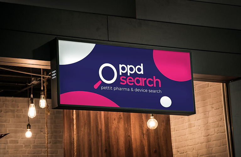
Our initial goal was to create a brand identity for the temporary recruitment arm of Pettit Pharma & Device Search, to be known as PPD People. However during the presentation of the initial logo concepts, alongside Concept 2 we posed a "what if" question to PPD Search. And that was to show what PPD Search would look like if it was in a similar style as Concept 2 with the objective of better aligning the two identities and potentially rebrand their entire business/brand identity.
What resulted was an agreeance and confirmation that a rebrand would fit with the timing of their new direction and mark a significant change for growth in their business.


